Creating a brand that conveys the appeal of Japanese food in the global market
Handmade udon noodles in London
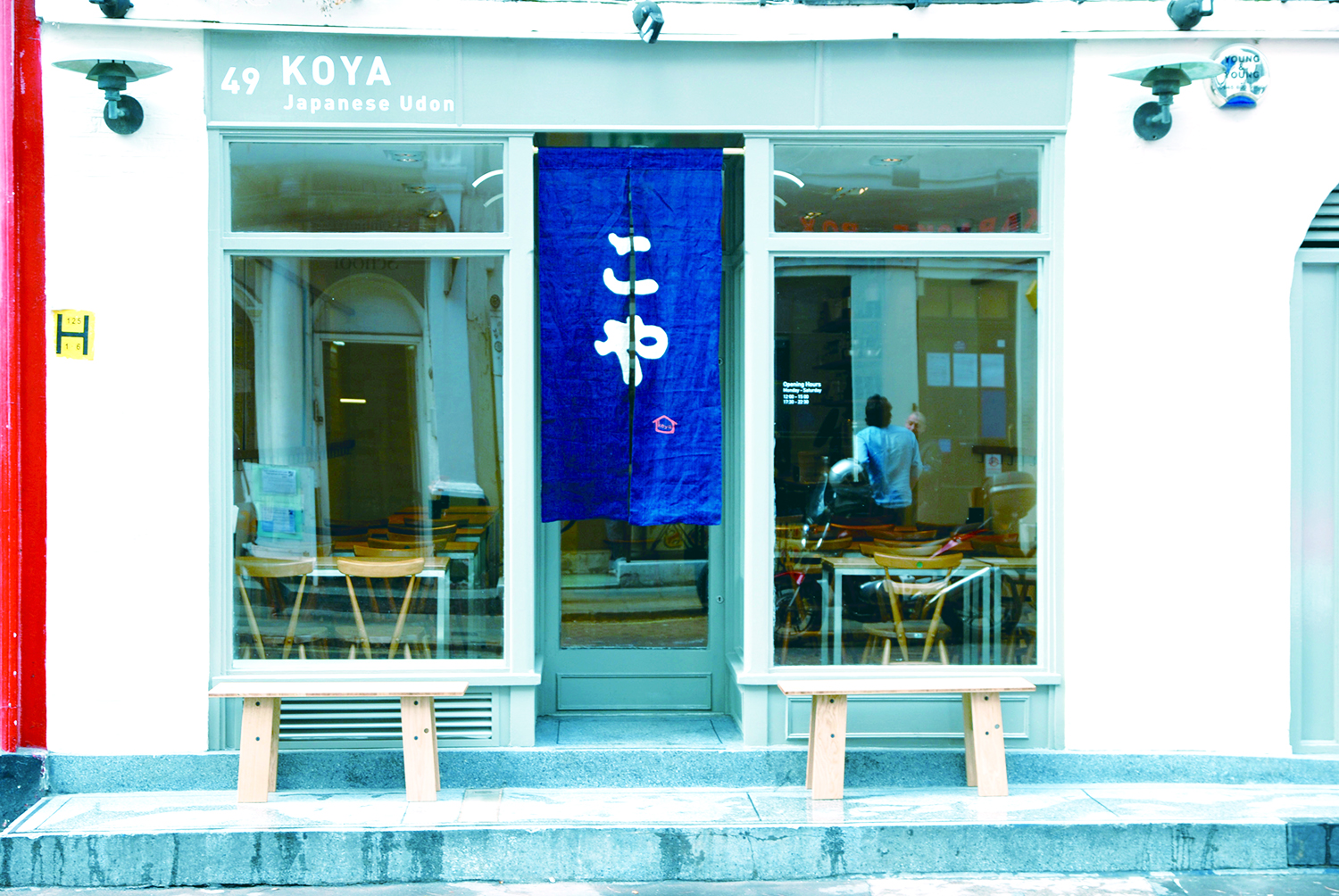
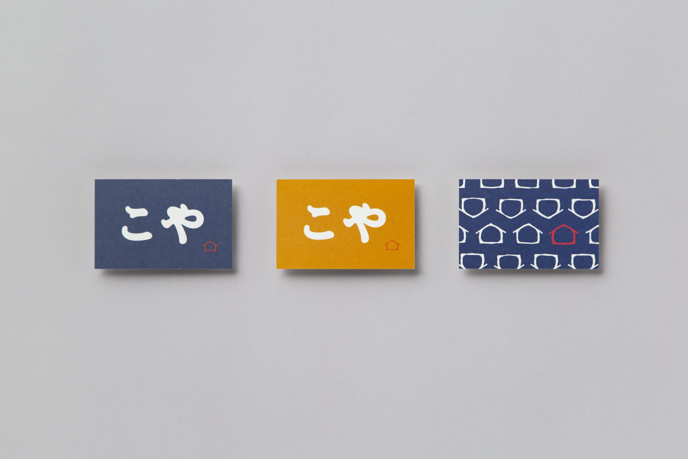
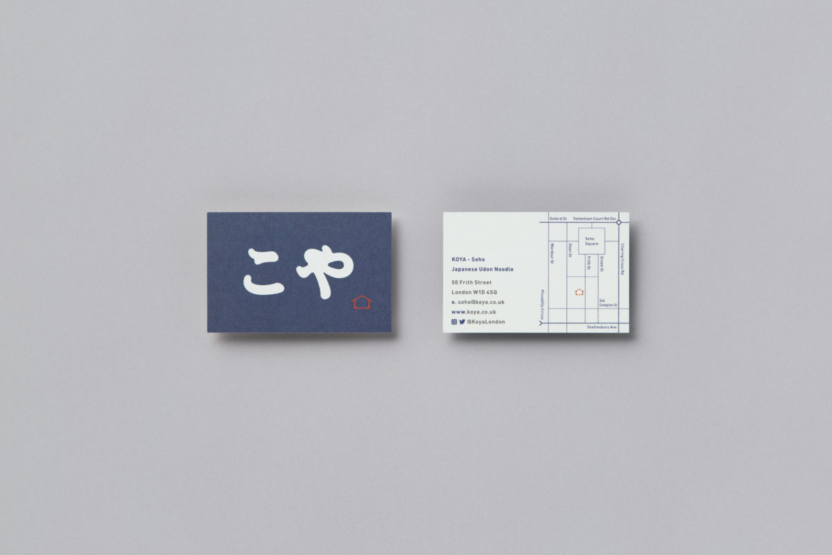
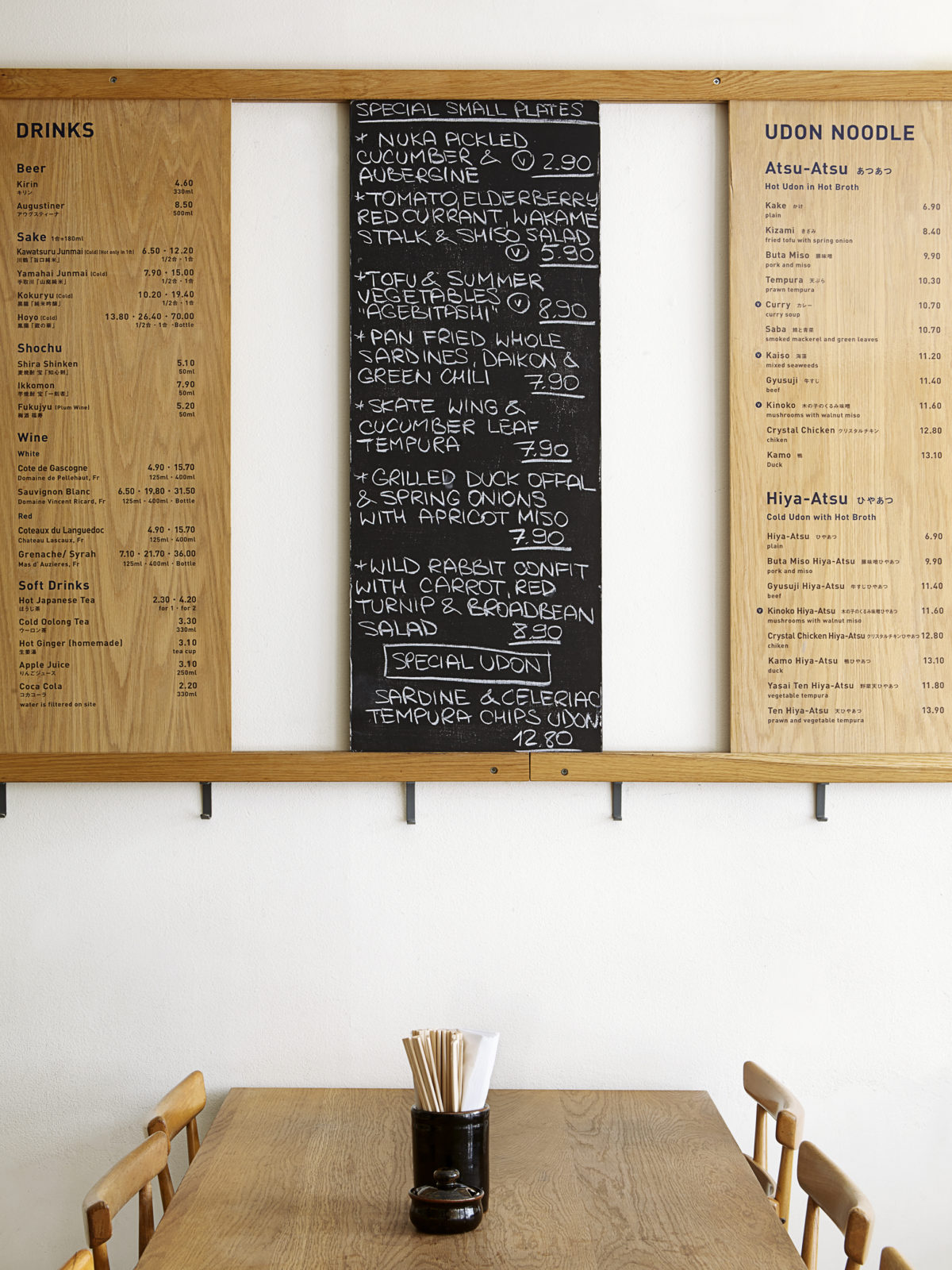
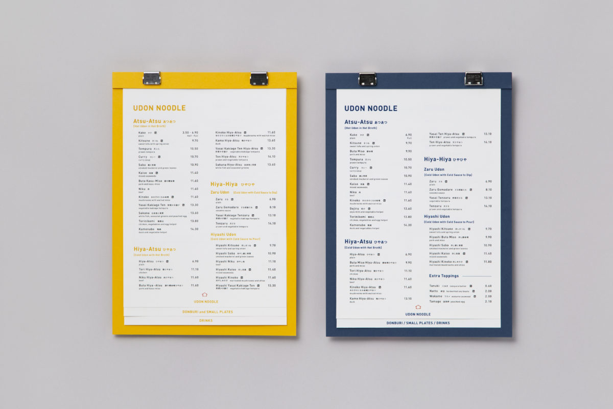
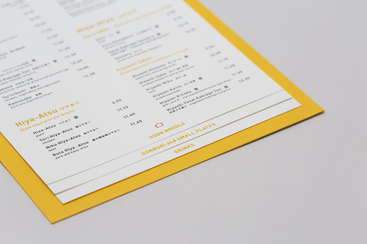
The UK’s first restaurant specializing in udon opened on Frith Street in London’s Soho district. In addition to authentic Sanuki udon noodles made with care from the soup stock, it proposes recipes that can be enjoyed internationally by combining the British breakfast style of full breakfast. ACTANT designed a series of communication tools, including the logotype and menu, to bring the traditional Japanese food culture of udon to London, making it acceptable in the London context.

Approach
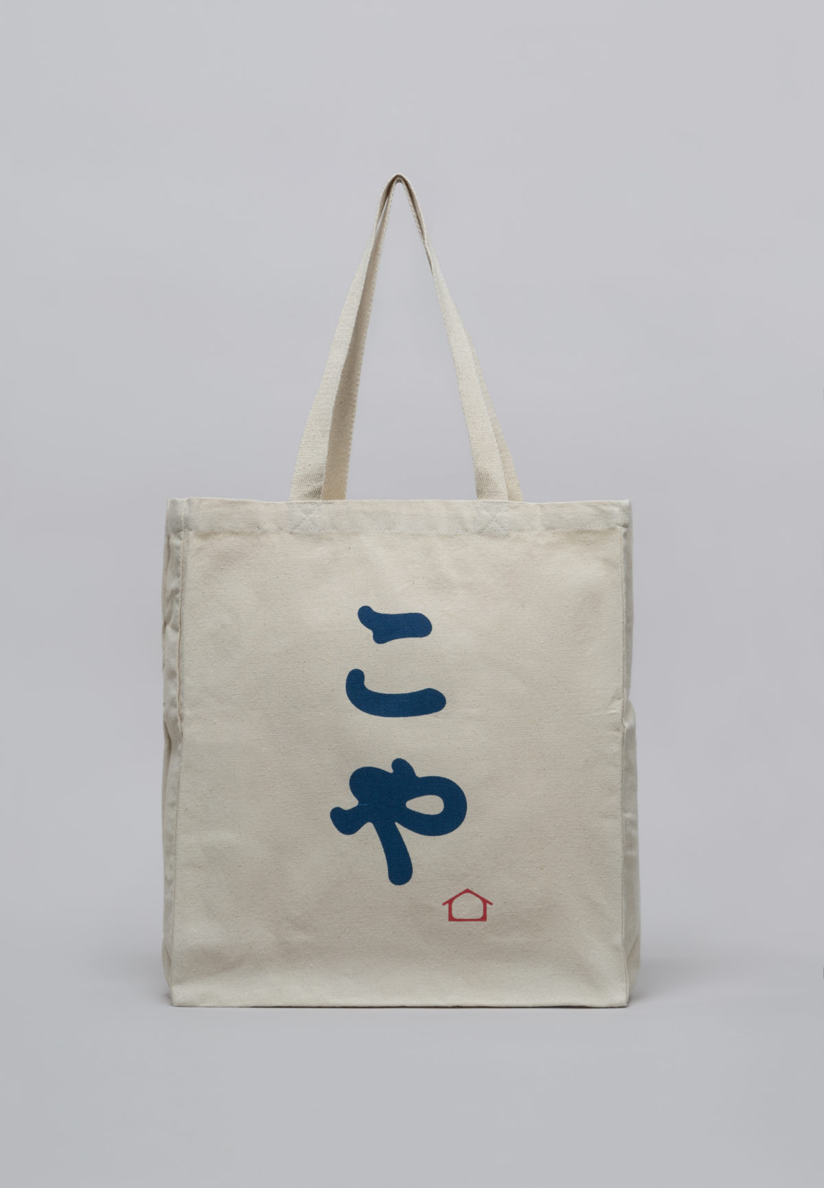
Using the Japanese hiragana logotype as an English logomark
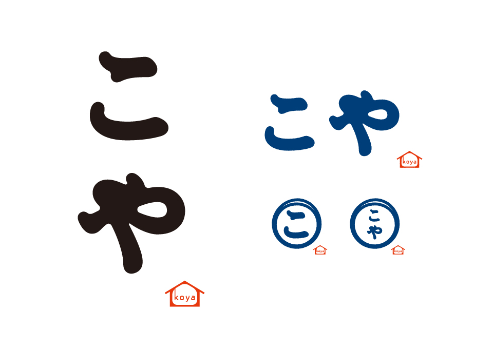
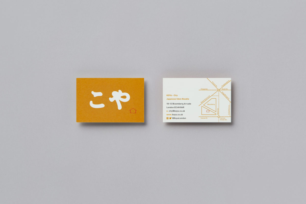
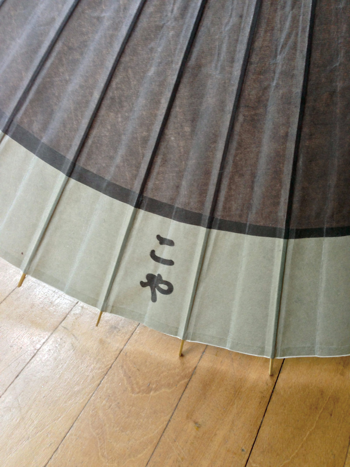
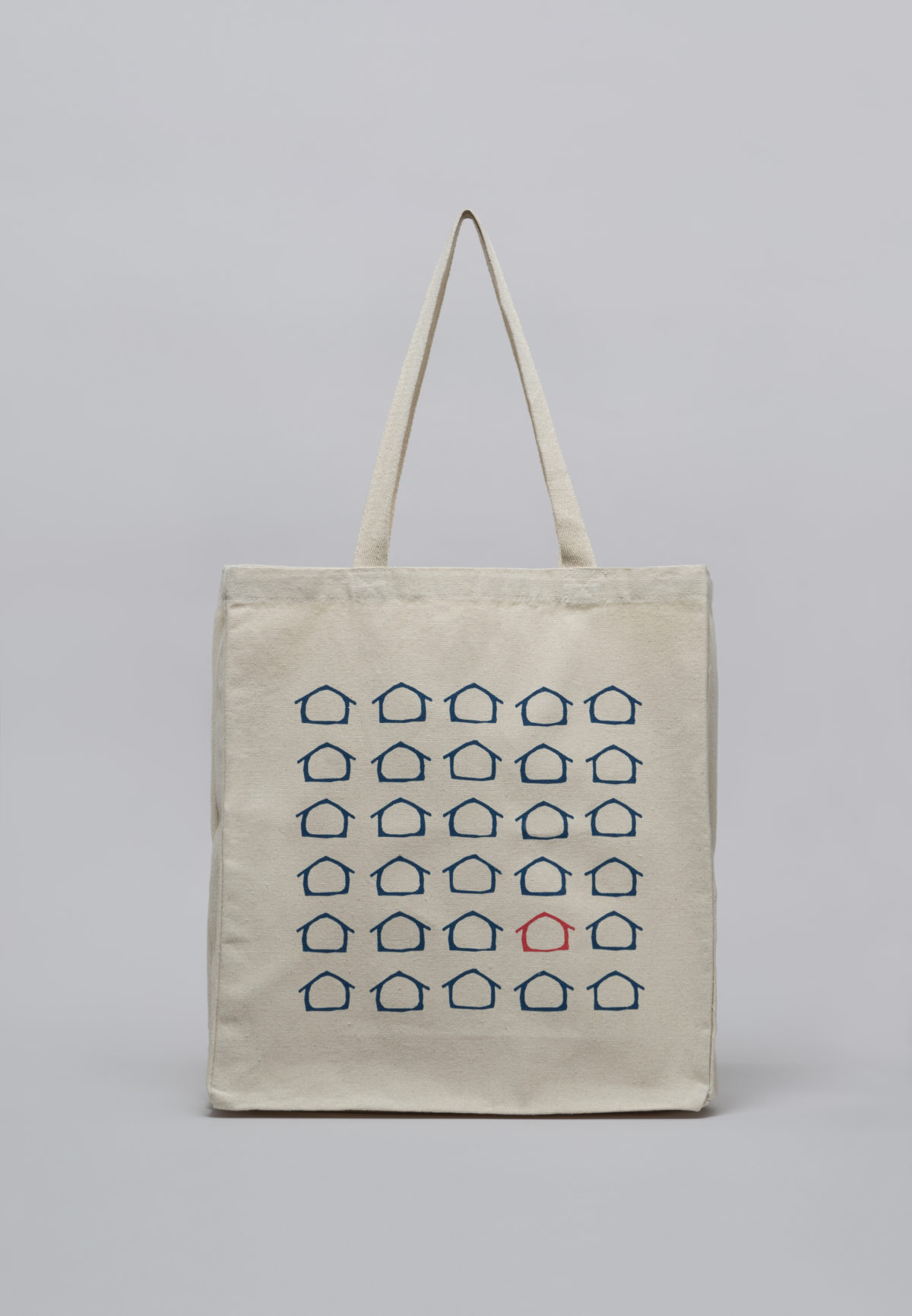
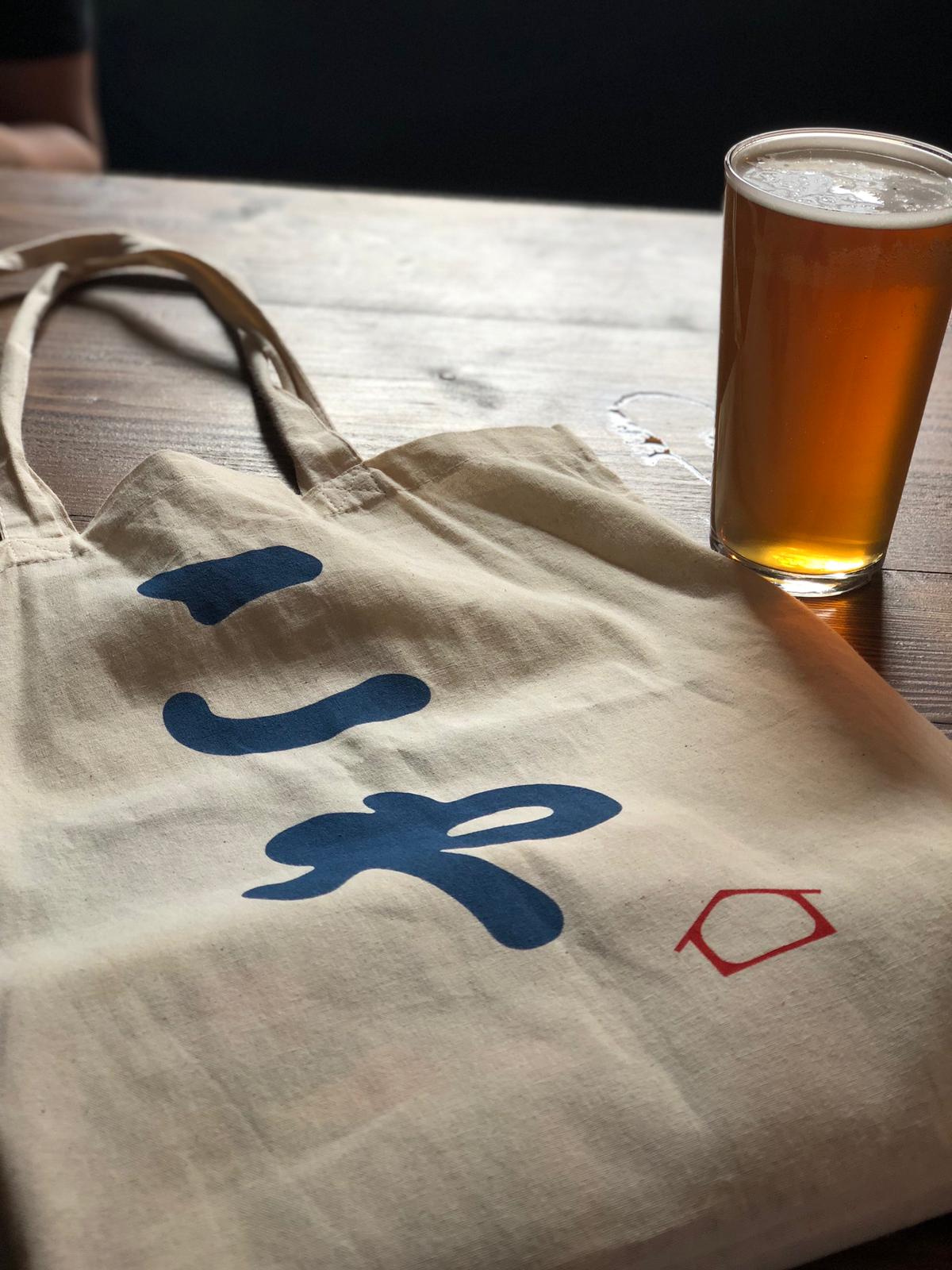
We used hiragana, which is not readable in English-speaking countries, as a logomark to express the shape of udon, which has many curves. It works as a logotype when seen by Japanese, but when seen by English people, it looks like udon is intertwined; and is a peculiar shape that symbolizes Japanese culture. In the 10 years since its opening, the brand has expanded to multiple locations, and has grown beyond the recognition of a new Japanese cuisine to become a locally familiar restaurant for everyday use.
