Information experience linked to spatial experience
Creating a consistent visual touch point
Selected for the 2016 Japan Sign Design Award.
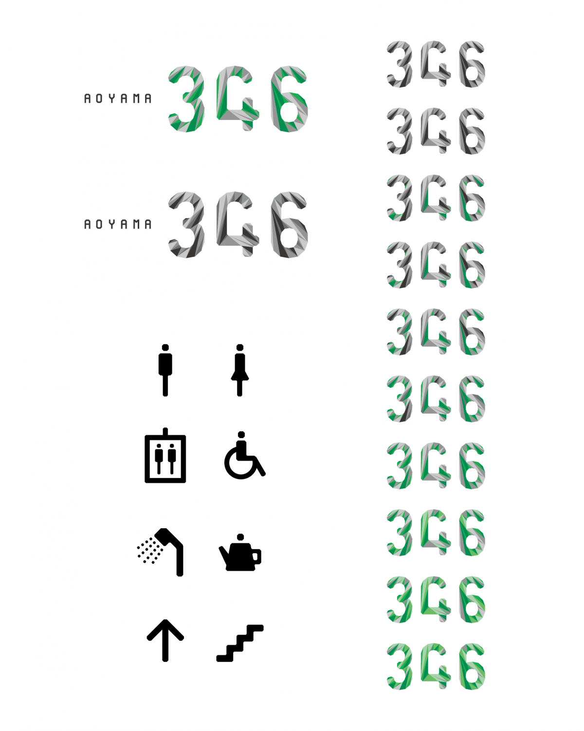
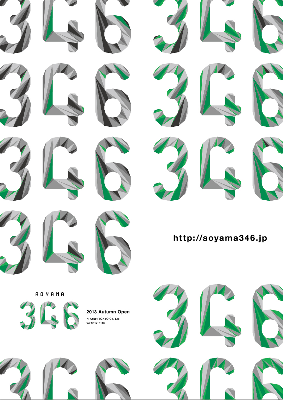
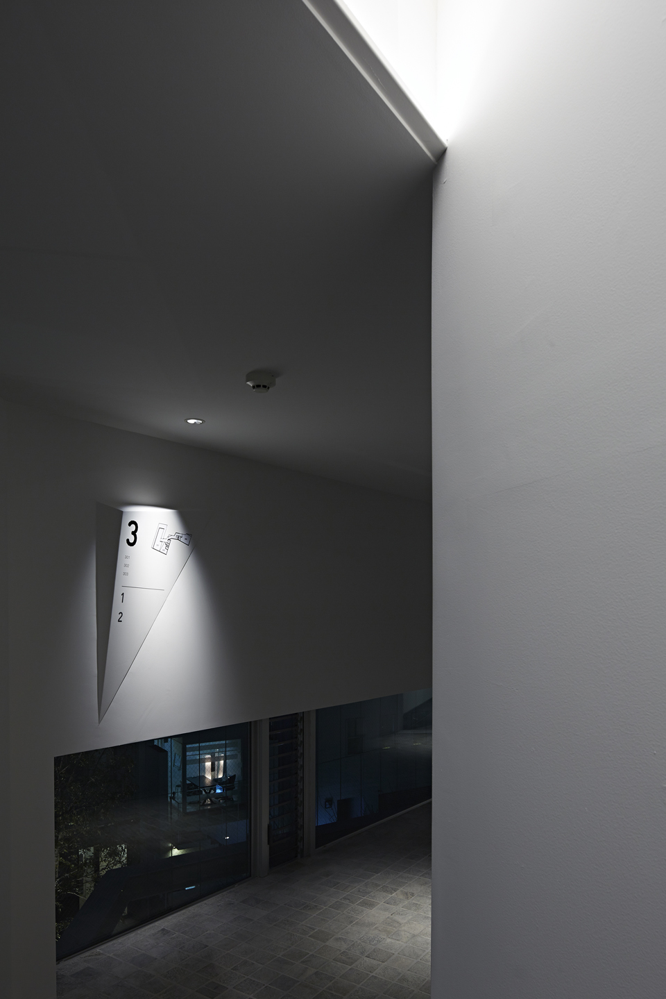
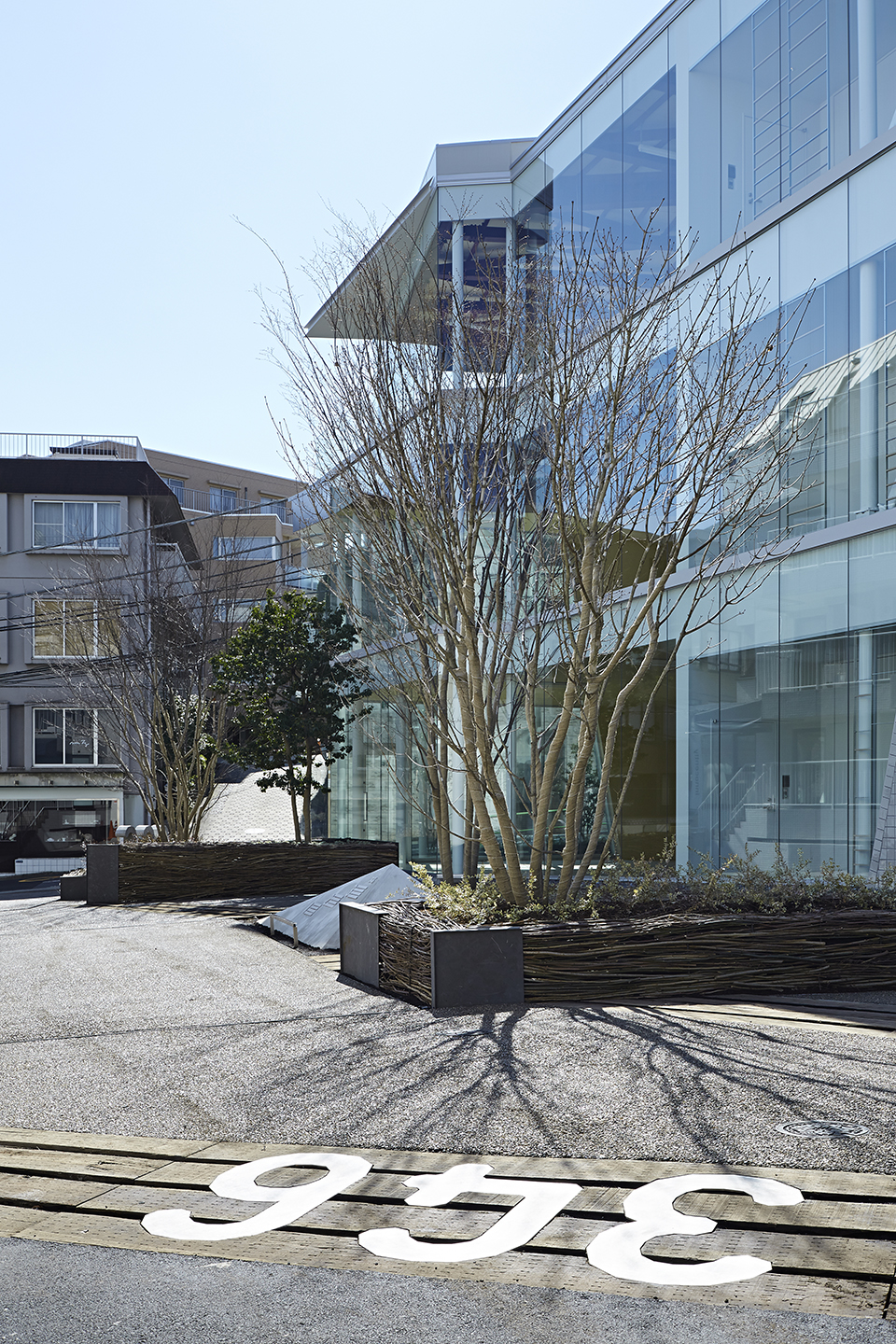
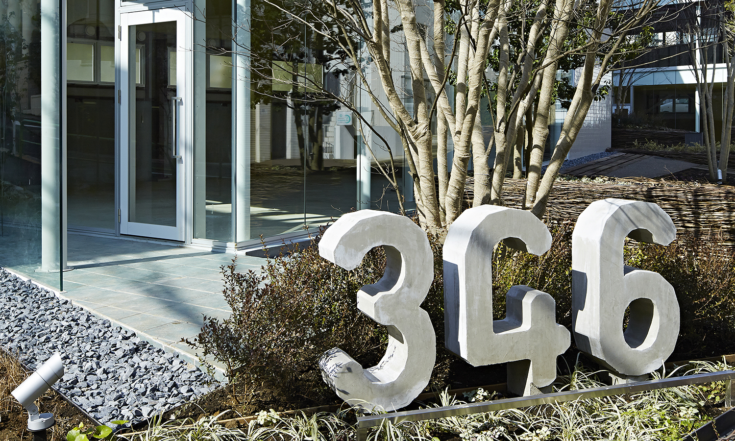
We designed various communication media for a commercial tenant building that opened in Aoyama. Based on a logotype that responds to the architecture that makes extensive use of triangles, we designed communication to guide tenants while maintaining consistency in the signage and website. In particular, the signage design is an experiment in increasing visibility by adopting a three-dimensional shape.
- Category
- Lifestyle
- Site/Year
- Tokyo / 2014
- Services
- Branding / Visual identity / Web design / Sign design
Yoshinari Takahashi(Design)、Kou Utashiro(Web Design)、Sasaki Architecture(Architect)、PLATdesign(Landscape Design)
Approach
A common language of “triangles” based on the characteristics of the land
Creating a holistic experience
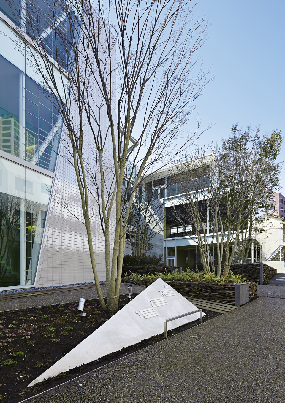
The site has a characteristic triangular shape with a large difference in elevation, so we consulted with the architects and decided on a “triangle” as the common element of the design. Based on the triangle, we designed a consistent visual touchpoint from the logo to the signage. By setting a common element, we were able to unify the perceptions of the architecture, landscape design, and lighting design involved in this project and create a consistent experience.
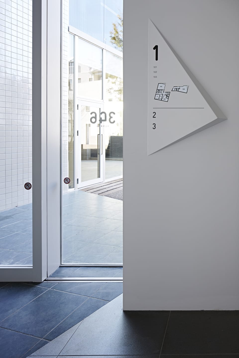
For the signage design in particular, we experimented with increasing visibility by adopting a three-dimensional triangular shape. When a three-dimensional triangle emerges from a white wall, its surface becomes an information presentation. By adjusting the angle of the face, we devised a way to ensure visibility even in complex locations where installation flexibility is limited.
